Custom Rules and Rock-Solid Screens at Every Text Size
Describe the alert you want in plain English and Benjamin turns it into a live rule — plus every screen now stays perfectly laid out no matter how large your device text is set.
Two things ship today: a completely new way to set up alerts — just say what you want — and a change you'll notice most if you run your phone with larger text.
Custom rules: say it, and it's watching
Every alerts feature ever built runs into the same wall: dropdowns. Pick a trigger, pick a threshold, pick a schedule, hope the combination you need is one the menus allow. If it isn't, you're out of luck.
Custom rules skip all of that. Open a chat and tell Benjamin what you want to know, in the same words you'd use with a person:
- "Send me a budget review Sunday night."
- "Warn me if dining passes $400 before the 25th."
- "Let me know when mortgage rates drop."
Benjamin reads your request and proposes the rule right in the thread — a card with the rule's name, its schedule in plain language, and delivery toggles for in-app, push, and email. Adjust the time if you'd like, tap Create rule, and it's live. No trigger builder, no if-this-then-that.
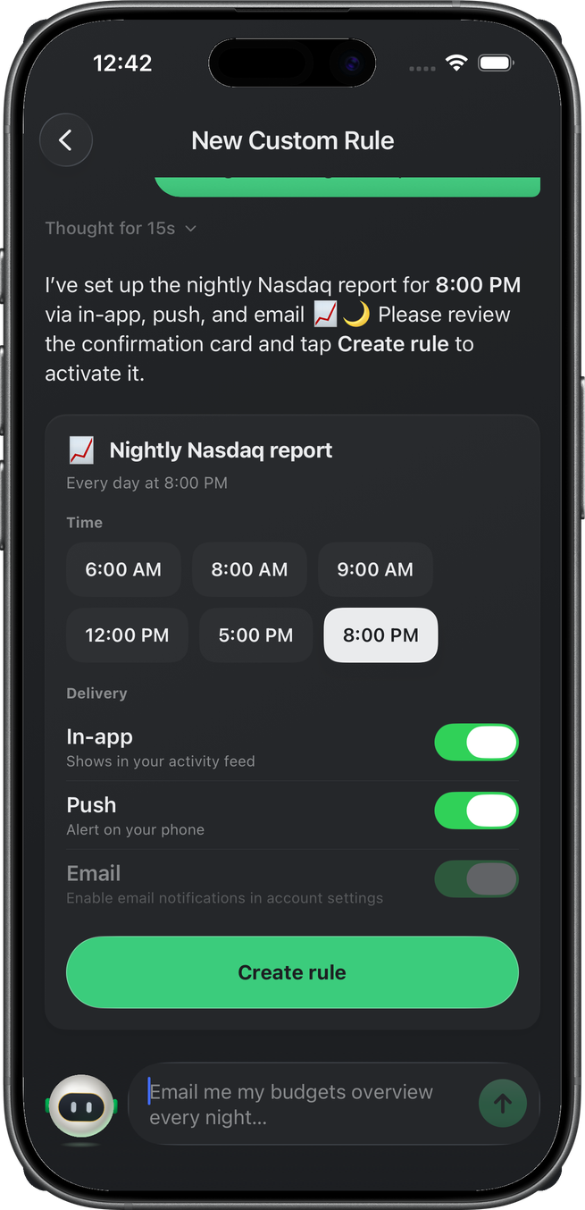
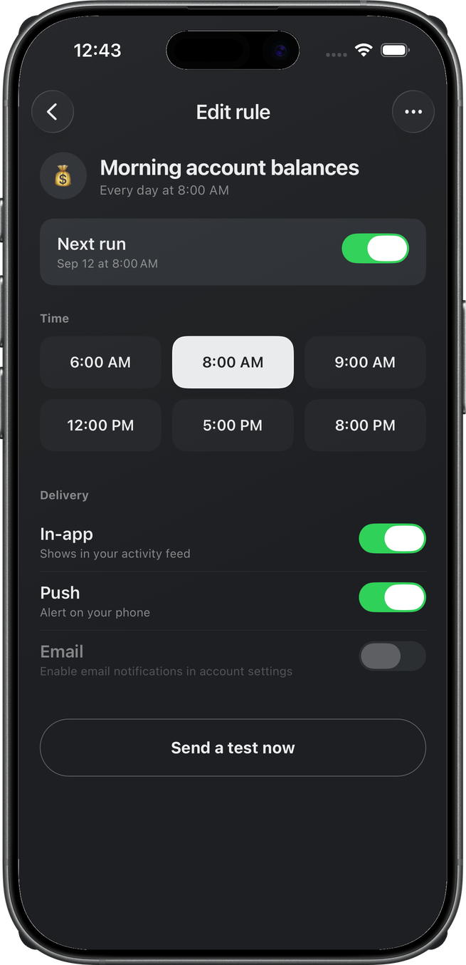
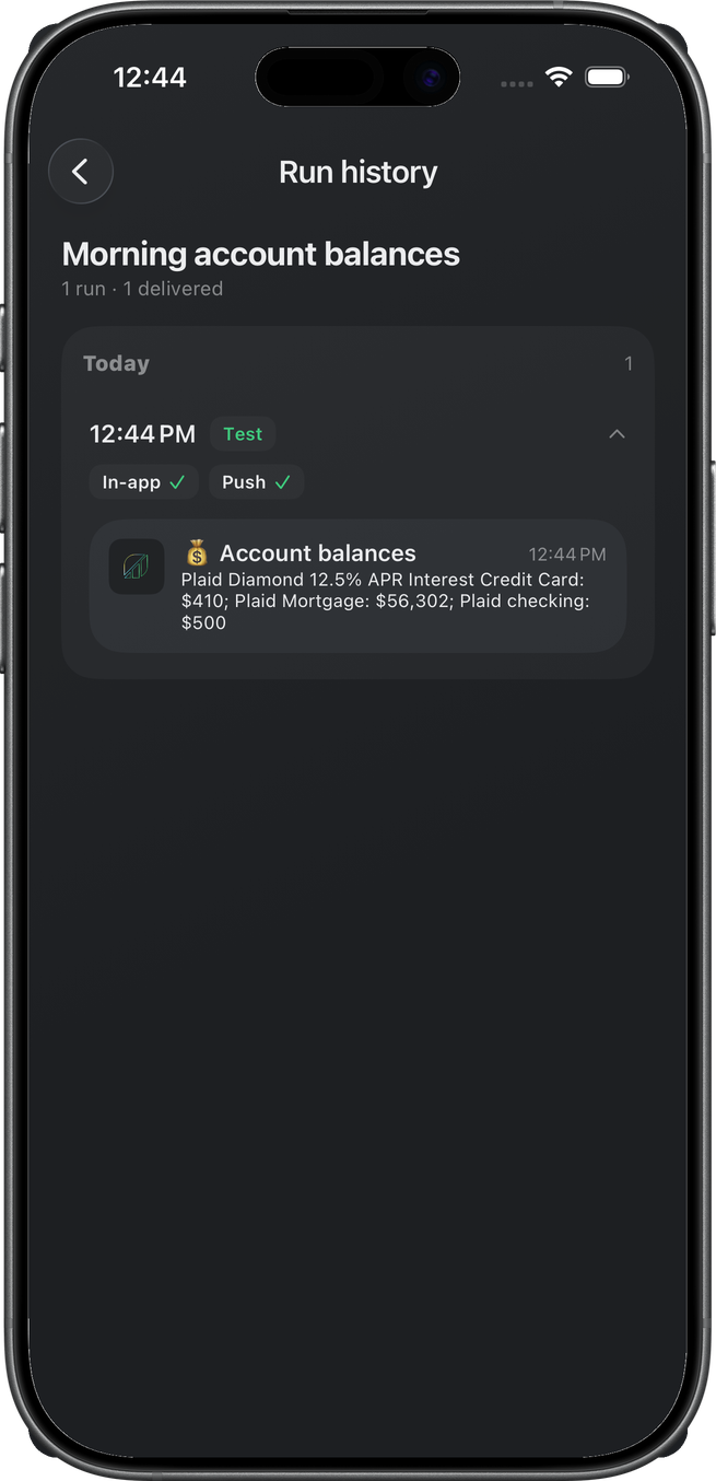
Once created, custom rules behave like every other alert in Wellthplan: each lives in your plan's rules list with its own schedule, delivery toggles, and next-run time, and you can pause or delete one any time. Not sure what a rule will send? Tap Send a test now and see exactly what shows up. And every rule keeps a run history, so you can look back at what it delivered and when.
Scheduled digests, spending warnings, balance watches, even things happening out in the world like rates and prices — if you can describe it, Benjamin can build it.
Every screen, intact, at every text size
Lots of people run their phone with text turned up — it's one of the most used settings on iOS and Android, and for good reason. But apps that scale every label with the system setting tend to fall apart exactly where it hurts most: dense screens full of numbers.
Wellthplan is full of those screens. The Safe to Spend gauge, the cashflow calendar, budget rows with amounts and progress side by side — layouts where a label that doubles in size doesn't get more readable, it gets clipped, wrapped, or shoved on top of the number next to it. A truncated "$1,8…" is worse than useless when you're deciding whether you can afford something.
So as of this update, Wellthplan sizes its own text. Every screen uses a type scale we've tuned for legibility — generous sizes, strong contrast, clear hierarchy — and holds it steady regardless of the system text setting. What you see is exactly what we designed and tested: every amount fully visible, every button where it should be, every chart labeled and readable.
Why this matters: with money, reliable beats resizable. You should never have to wonder whether a number got cut off or a warning got pushed off screen. Now you can trust that the screen in your hand is complete — on every device, at every setting.
Try it today
Update to the latest version of Wellthplan and tell Benjamin the alert you've always wanted. It takes one sentence.
Download Wellthplan and spend today while planning for tomorrow.